CSS belongs to a triplet of core web technologies alongside HTML and JavaScript. With careful planning, CSS contributes to a separation of concerns. Independent resources control a content’s structure, its presentation, and its behavior.
Style Sheets play an important role in accessibility, scalability, and even web performance. As a content author or web designer, they give you control over how devices render content. From layout to font size and color, CSS transforms content into beautiful-looking pages.
What Does CSS Look Like?
CSS is a big language—there are lots of different things to style! But its syntax is straightforward, with only a few rules to learn.
HTML elements have various properties that CSS can style. The color property sets the foreground (e.g. text) color. Font size depends on the font-size property.
Each property can be set to a supported value. The assignment of a value to a property is a “declaration.” Generally, they look like this:
property: valueFor example:
color: redValues for different properties can look very different, even values for the same property. For example, here are two more ways of writing the previous declaration:
color: #ff0000
color: rgb(255, 0, 0)
How HTML and Style Sheets Come Together
You can combine HTML and CSS in a few different ways, each with its advantages.
Writing Styles Inline
The simplest method is to attach style declarations directly to an element in the HTML file. You can do this using the style attribute like so:
    Most of this text is red …
    … but this isn’t!
While styling elements inline like this can be convenient, it has several drawbacks. For a start, it complicates the HTML, making it harder to read at a glance. It’s also awkward to maintain: imagine a long document in which we want to set the color of every paragraph. This is CSS, but it’s not “Style Sheets.”
Embedding Styles in the Head
You can start to see what a Style Sheet looks like with the second mechanism, embedding. Using this approach, we gather all the style declarations together inside a style element in the head of our document. It’ll look something like this:
...Our style instructions need a bit more detail than before, though. Since we’ve moved them to the head, each rule is no longer associated with an element. We might have declared color: red, but what should have that color?
This is where CSS selectors come in. They allow us to target specific parts of the page and define their style in one place, using this syntax:
selector {
    declaration1;
    declaration2;
    /* etc. */
}
For example, to style paragraphs’ text blue, we can specify the following:
p {
    color: blue;
}
In this example, the selector is simply p, which matches all paragraph elements in our document. It’ll color all text blue, so long as it’s in
tags.
Linking an External Style Sheet
The final method to cover is linking. This is, by far, the most useful approach, and one that you should opt for most of the time. Instead of embedding CSS rules in the style element directly in your document, you can move them out to a separate file.
Paste this code inside the tags of your HTML file to link your external style sheet.
The Power of CSS
With the linked method, we’re harnessing a core power of CSS: separation of concerns. All the semantic information—what the content means—is contained in the HTML document. The styling—what it looks like—is in a separate file, the style sheet.
Here are just a few benefits of this separation:
- You can switch out a style sheet just by changing the file reference. This can even happen dynamically. In one step, you can alter the entire look and feel of a page.
- Many pages can share the same style sheets as required. By changing one single file, you can update the look and feel of an entire website.
- Splitting a page into ‘content’ and ‘style’ has technical benefits. Proxies and browsers can cache individual files separately. This means a site can send its style information once, rather than including it in every single page.
- When collaborating, different teams can work to their strengths, creating and editing separate files without affecting each other.
Explaining the Cascade
You’ve learned a lot about styles and style sheets, but what about the “cascading” part of CSS?
The cascade is what decides which styles to use when multiple style sheets are present. You’ve seen how an author can specify styles for their content. But another feature of CSS is that it gives readers and browser manufacturers some say in the matter too.
You might’ve already wondered about default styles. For example, how does an H1 element appear big and bold, even without any author style sheets? This is thanks to a set of special rules which make up the user agent style sheet. These rules are initially applied by your web browser to every page you visit.
The cascade specifies that an author style sheet applies after the user-agent styles. If our browser says “headings are bold” but the author of the page declares “headings on this page are light,” then they’ll end up light.
There’s another style sheet source that hands over some control to the reader. Any web user can, in theory, maintain a user style sheet with custom rules. These sit in the middle: user rules will override default browser settings, but will themselves be overridden by author styles. Sadly, support for user style sheets has never been widespread.
Targeting Different Media
You can use Style Sheets in different contexts, beyond the screen. The media attribute of the link element defines which media types the style sheet applies to. For example, you can define a style sheet for print using markup like the following:
You can gather common styles in one global style sheet and media-specific styles in separate files. There are even media types to cater for aural or braille presentations of your content. CSS is a vital tool in improving accessibility.
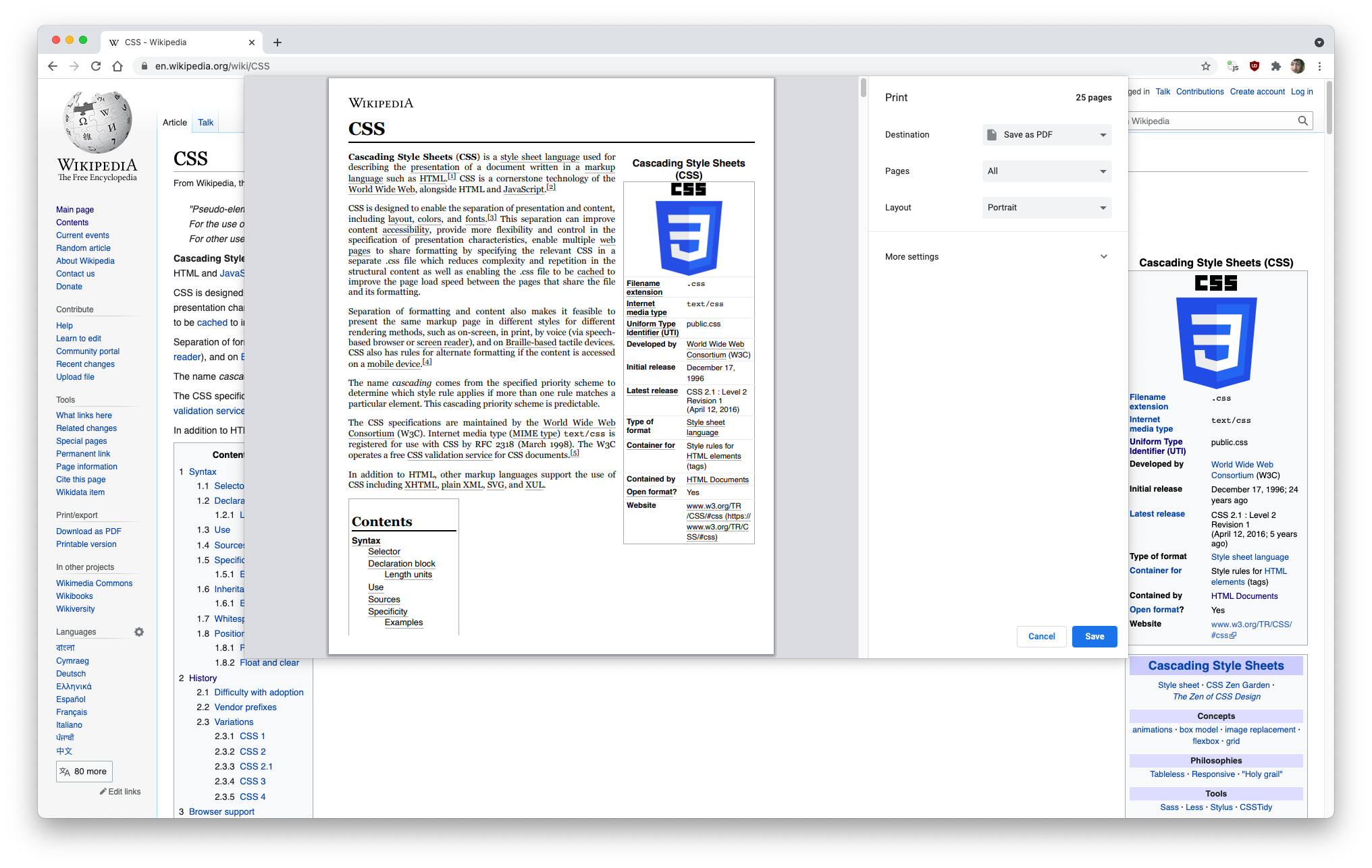
Sites such as Wikipedia use CSS to control their print style, hide unwanted elements, and simplify the layout.
CSS Makes HTML Look Good
Cascading Style Sheets cover a lot: the cascade, inheritance, selectors, sources, media, etc. But their power enables the modern web. This is a medium that provides reusability, flexibility, and accessibility features built-in.
To see the full power of CSS and how much it has to offer, check out our cheat sheet covering all the essential CSS3 properties.